The Most Common Elements in Mobile-Optimized Bank and Credit Union Websites
The team here at Inet studied over 30 bank and credit union websites to evaluate mobile-optimization levels. We discovered consistent features throughout nearly all of the bank and credit union mobile websites, but were disappointed that a couple of key features are missing from a majority of these mobile-optimized websites.
First Up, the Mobile Optimization Wall of Shame
During our study and at the time I published this post, these two bank websites did not provide a truly good mobile-optimized experience:
The above screenshots underscore the importance of providing a mobile-optimized website. Without zooming or scrolling, text is unreadable, links are difficult to click, and form fields are too tiny to accurately select.
There were also a couple of websites that clung to older web design trends and thus provided mobile visitors with a less than stellar experience:
While the home pages in the screenshots above do offer a mobile-optimized version, they opted to leave the main navigation items as small text that will be hard for most users to accurately click. Other text on the page is too small to read.
In summary, when creating a mobile-optimized website you should make the text as large as possible and replace basic text links with large tap-able buttons.
Automatic Redirection is 'Key'
I can not emphasize it enough. If you have a mobile-optimized website, your desktop website should detect mobile devices and automatically redirect the user. How else are they going to find it?
What would you rather type on a touch screen or tiny keypad? "key.com" or https://www.key.com/gen/html/key-bank-mobile-banking.htm". I don't even want to ask how that ended up being the address to the home page of their mobile-optimized website.
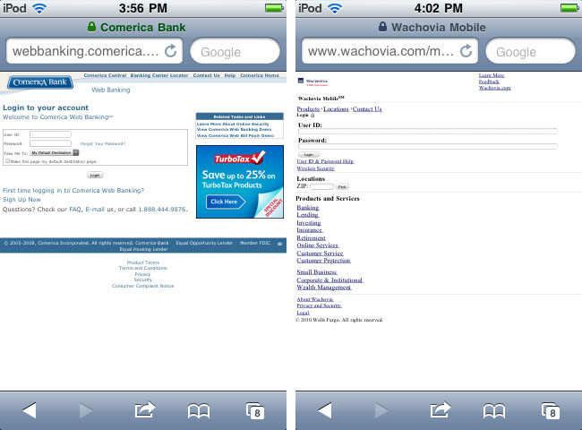
Common Element #1: Home Banking Login
Appearing on 96.55% of the banking websites we looked at, a mobile banking login was overwhelmingly the most popular feature. If your mobile-optimized banking website does not direct or log your members into a mobile optimized home banking system, it needs to. We've found time and time again through click-tracking and analytics that home banking login is the #1 feature on not only a desktop website, but a mobile-optimized one as well.
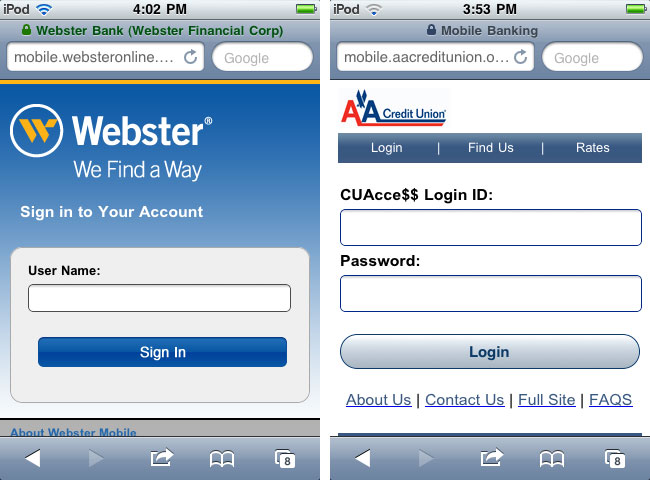
Whether a link to home banking, a username that's passed over, or a full username and password combo, a home banking login is crucial to your mobile-optimized banking website.
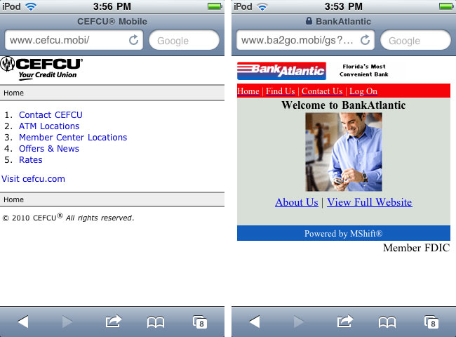
Common Element #2: Locations
Coming in at the second most popular in our study, with 86.21% of the sites containing one, a locations page is another must-have page on your mobile-optimized website. While users are on the go, a common need is to find the closest non-foreign ATM or branch and a mobile phone is the easiest method for people to lookup this information. Your locations page (or results) should have clickable addresses that launch a map application such as Google Maps. Your phone number links should be clickable to automatically dial the phone number, too.
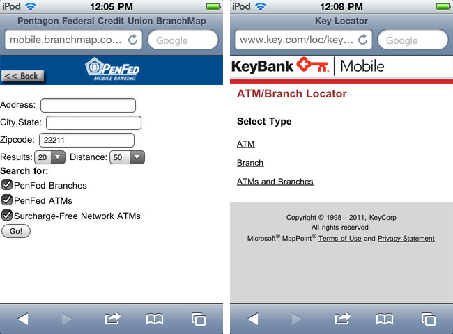
PenFed gives the users a mostly simple form to complete to find locations with options for branch or ATM search. KeyBank has you choose what you're searching for first.
Common Elements #3: A tie between Contact Page and Link to Desktop Version of the Website
Many mobile devices are sophisticated enough to display a desktop version of your website, as we saw in the wall of shame, but that doesn't mean it should be the first impression you give to a mobile user. Of course, if you have certain services or features that your users are accustom to using and aren't (yet) available on your mobile website, give users a link to the "desktop" version of those web pages.
Many banks and credit unions combine their locations and contact pages. But lets not confuse their use on a mobile website. The locations page should offer a brief list of addresses for branches and ATMs, or a simple to use search form (requiring nothing more than a ZIP code or even capturing that data from the GPS in their mobile device) if you have many branches and ATM locations. A contact page on the other hand should provide a simple form to contact your institution and also provide clickable phone number links that dial numbers automatically for the user.
Only 55% of the 30+ websites we studied contained a contact page.
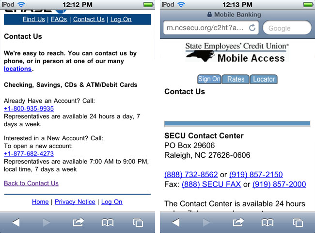
It's great that these contact pages have clickable phone numbers. But why not link the addresses to Google Maps? How about a simple contact form designed for easy mobile input?
Common Element #4: About Page
A surprising 38% of the mobile-optimized bank websites we studied contained an About Us page. Based on research we've conducted, click tracking shows that About Us pages, especially on mobile-optimized sites, are rarely visited. Given the low likelihood of clicks to this content, we recommend eliminating it or at least giving it a low priority in the navigational structure. (This pattern could change as the number of people who use their mobile devices as their primary Internet browsing tool grows.)
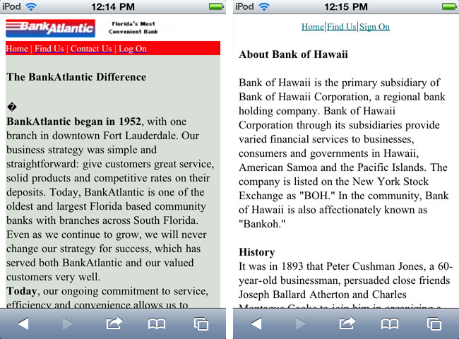
These websites provide such compelling and useful on-the-go information.
Common Element #5: Rates Page
Another surprising find was that only 24% of websites offered a Rates page. Auto dealers and department stores are offering your customers financing deals every opportunity they can. How many car loans does your bank lose because a customer did not or could not easily compare your rates to the current offer on the table? Those are the opportune times for your users to visit your rates page to compare your rates to that of the auto dealer or other competitor. A Rates page is one feature that could lead to an increase in loan and credit card opportunities.
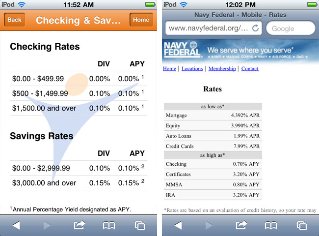
Tri-Pointe Community Credit Union provides multiple categories of rates while Navy Federal provides a simple, yet useful rates page.
What now?
If you'd like to learn more about the Dos and Don'ts of Mobile-Optimized websites, check out our blog post entitled Free Guide for Bankers Considering Mobile Apps and Mobile-Optimized Websites where you can download a free white paper about mobile-optimized websites vs. mobile apps.
Download Your Free Copy.
Other Recent Blog Posts
Find this useful?
Want to receive our monthly tip to make your website easier to use and safer? No spam, just good advice. Signup!
Interests